03 · How Many Strangers Can Look for Your Car?
California People Plates and Paths, Warrantless Out-of-State Searches
THIS DIDN'T STAY IN CALIFORNIA.
DOCUMENTED
259,190
entries naming organizations associated with the states outside California examined here
2,021
organization names appearing in the data
Six states each appear more than 20,000 times: Texas, Georgia, Illinois, Florida, Ohio and Indiana.

The geography exploded. During February–March 2025, it wasn’t just the number of entries that changed. The organization names in the data pointed far beyond California.
DOCUMENTED
SIX STATES DOMINATE THE RECORD.
- TX · Texas53,277
- GA · Georgia47,312
- IL · Illinois30,035
- FL · Florida26,810
- OH · Ohio20,275
- IN · Indiana20,070
Together, six states account for 197,779 entries—approximately 76% of the 259,190 out-of-state entries examined here.
WHY?
3.1 TEXAS
53,277 ENTRIES.
Texas shows up 53,277 times in the out-of-state data we examined—more than one in five entries, and more than any other state in this review.
WHY TEXAS?
How were these agencies connected? Who was allowed to use what? What changed during February–March 2025 to put Texas here so often? What did VCSO learn when it reviewed what it later called a “data searching issue”?
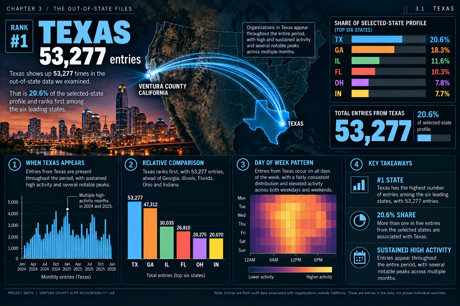
What this chart means—and how it was made
Shares use all 259,190 examined entries, even where the graphic says “top six.” Map arcs show state associations, not vehicle routes or search direction. The timing and duration plots have not been independently verified against the underlying audit files.
Source: State dashboard; audit-data methods and source limits are in Supporting Materials.
3.2 GEORGIA
TEXAS WASN'T AN OUTLIER BY ITSELF.
47,312 ENTRIES.
Georgia appears 47,312 times—second only to Texas, with just 5,965 fewer entries.
WHY IS GEORGIA ALMOST AS LARGE AS TEXAS?
Texas was not the only distant state appearing this often. Which connections and access permissions explain Georgia appearing almost as often?
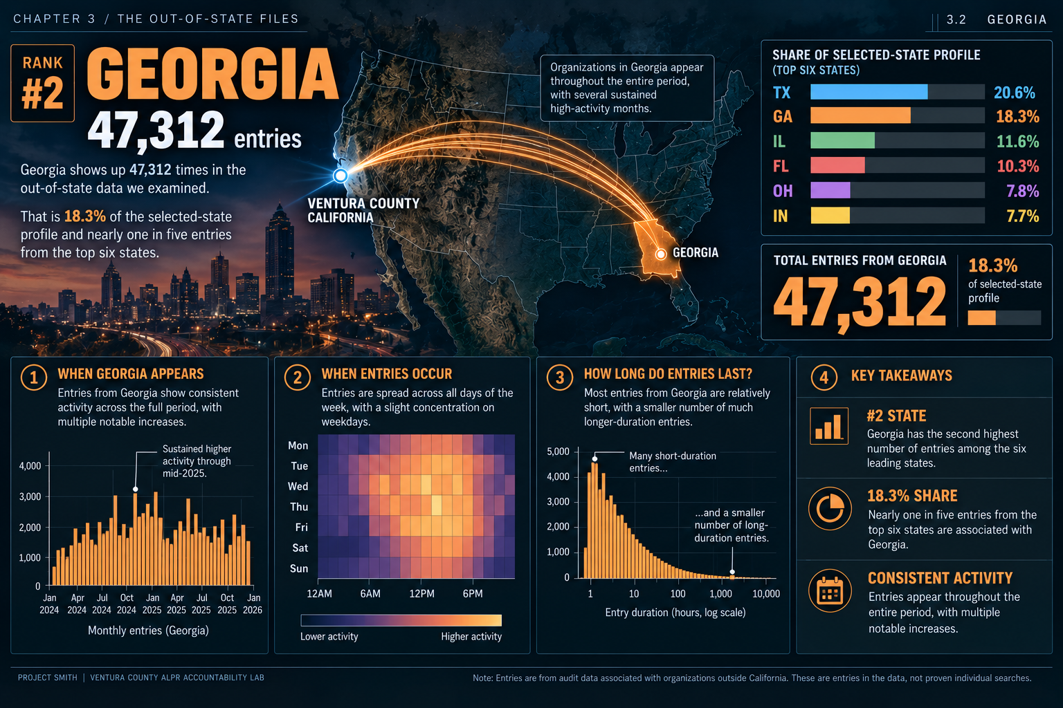
What this chart means—and how it was made
Shares use all 259,190 examined entries, even where the graphic says “top six.” Map arcs show state associations, not vehicle routes or search direction. The timing and duration plots have not been independently verified against the underlying audit files.
Source: State dashboard; audit-data methods and source limits are in Supporting Materials.
3.3 ILLINOIS
THEN COMES ILLINOIS.
30,035 ENTRIES.
Illinois adds 30,035 entries. Texas, Georgia and Illinois together account for 130,624—more than half of the 259,190 entries examined here. This is no longer a question about one distant state.
WHY WERE SO MANY DISTANT STATES SHOWING UP AT THIS SCALE?
Another distant state appears tens of thousands of times. What connected these systems? Why were these organization names in the data VCSO provided?
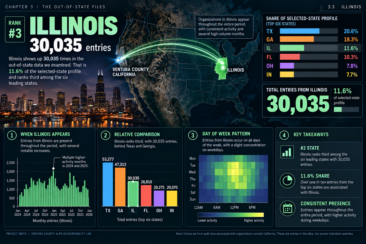
What this chart means—and how it was made
Shares use all 259,190 examined entries, even where the graphic says “top six.” Map arcs show state associations, not vehicle routes or search direction. The timing and duration plots have not been independently verified against the underlying audit files.
Source: State dashboard; audit-data methods and source limits are in Supporting Materials.
3.4 FLORIDA
FROM ONE COAST TO THE OTHER.
26,810 ENTRIES.
Florida adds 26,810 entries and another coast. The first four states now account for 157,434 entries—more than 60% of the total examined here.
WHY FLORIDA?
From California to Florida: which agency connections and access permissions explain this coast-to-coast pattern? What did VCSO’s review explain?
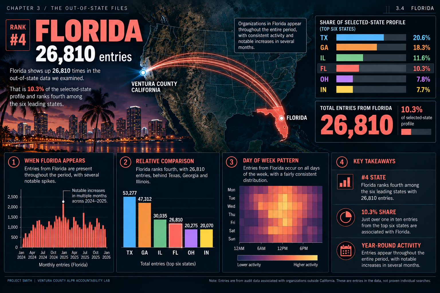
What this chart means—and how it was made
Shares use all 259,190 examined entries, even where the graphic says “top six.” Map arcs show state associations, not vehicle routes or search direction. The timing and duration plots have not been independently verified against the underlying audit files.
Source: State dashboard; audit-data methods and source limits are in Supporting Materials.
3.5 OHIO
AND THE PATTERN KEEPS GOING.
20,275 ENTRIES.
Even the fifth state, Ohio, exceeds 20,000 entries: 20,275. The pattern has a high floor, not just one or two large peaks.
WHY OHIO?
Then look next door. Indiana is almost identical in scale. What explains that pairing?
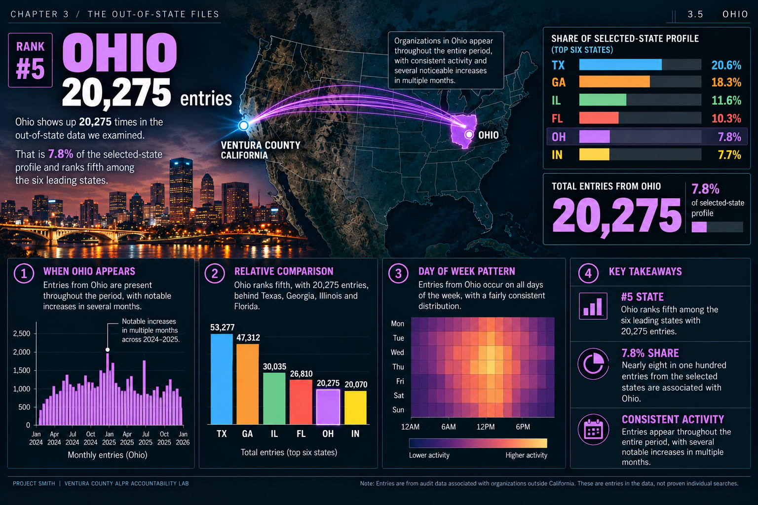
What this chart means—and how it was made
Shares use all 259,190 examined entries, even where the graphic says “top six.” Map arcs show state associations, not vehicle routes or search direction. The timing and duration plots have not been independently verified against the underlying audit files.
Source: State dashboard; audit-data methods and source limits are in Supporting Materials.
3.6 INDIANA
OHIO: 20,275. INDIANA: 20,070.
20,070 ENTRIES.
Indiana adds 20,070 entries—only 205 fewer than Ohio. Together, the six states reach 197,779 entries: approximately 76% of the total examined here.
WHY DO TWO DIFFERENT MIDWESTERN STATES APPEAR AT NEARLY IDENTICAL SCALE?
Six states, each above 20,000. Which connections, permissions or system changes explain that pattern? The audit should answer.
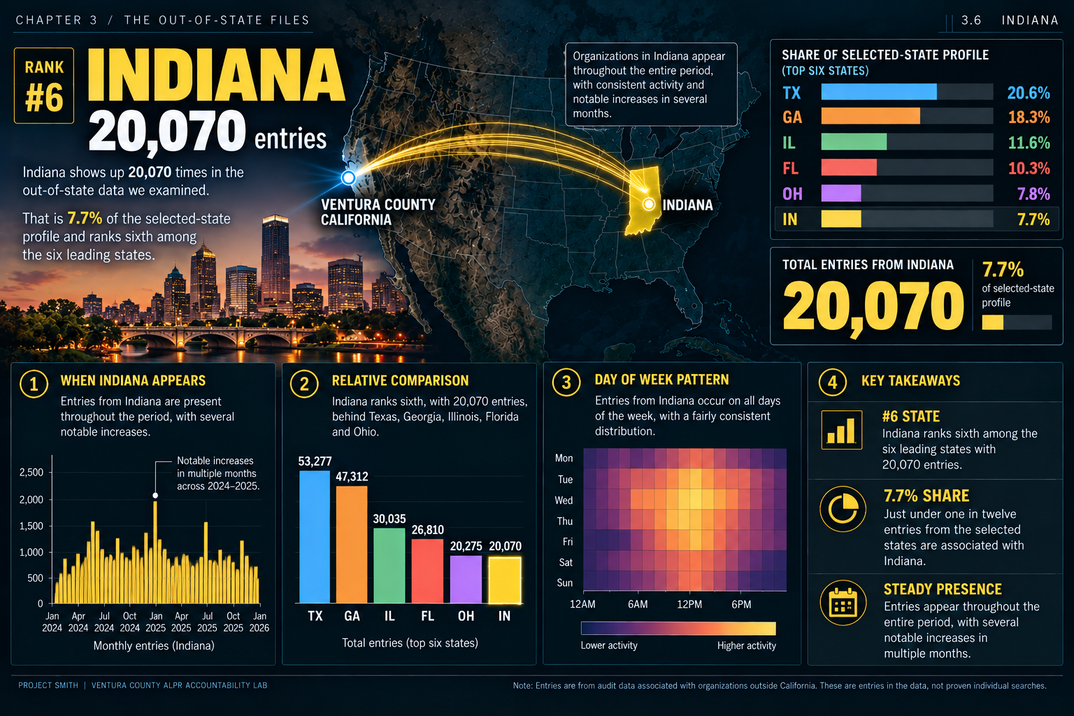
What this chart means—and how it was made
Shares use all 259,190 examined entries, even where the graphic says “top six.” Map arcs show state associations, not vehicle routes or search direction. The timing and duration plots have not been independently verified against the underlying audit files.
Source: State dashboard; audit-data methods and source limits are in Supporting Materials.
SIX STATES. 197,779 ENTRIES.
approximately 76% of the 259,190 out-of-state entries examined here
A MULTI-STATE PATTERN.
WHAT OPENED THE DOOR?
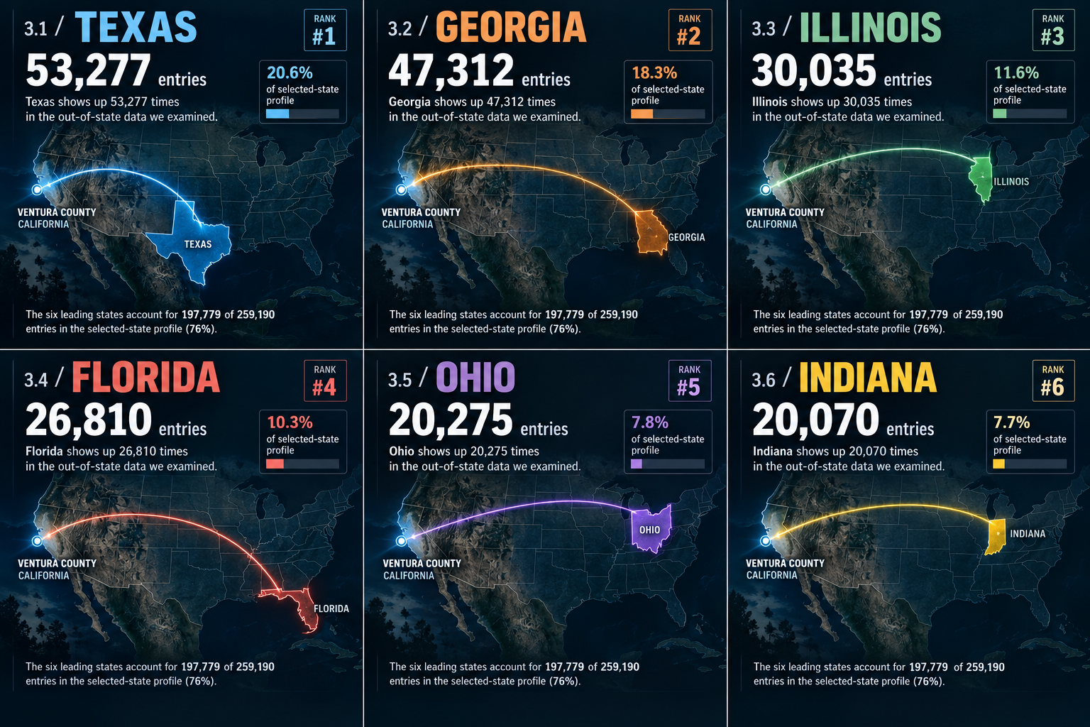
What this chart means—and how it was made
Each state’s share uses all 259,190 examined entries, not only the six-state subtotal. Map arcs show state associations, not vehicle journeys or search direction.
Source: Six-state summary; methods and source limits are in Supporting Materials.
3.7 THE VIRGINIA EXCEPTION
VIRGINIA MATTERS FOR A DIFFERENT REASON.
14,569 ENTRIES.
Virginia’s 14,569 entries put it outside the top six by frequency. But entry count is not the only dimension that matters. Fairfax County Police Department stands out in requested camera-time.
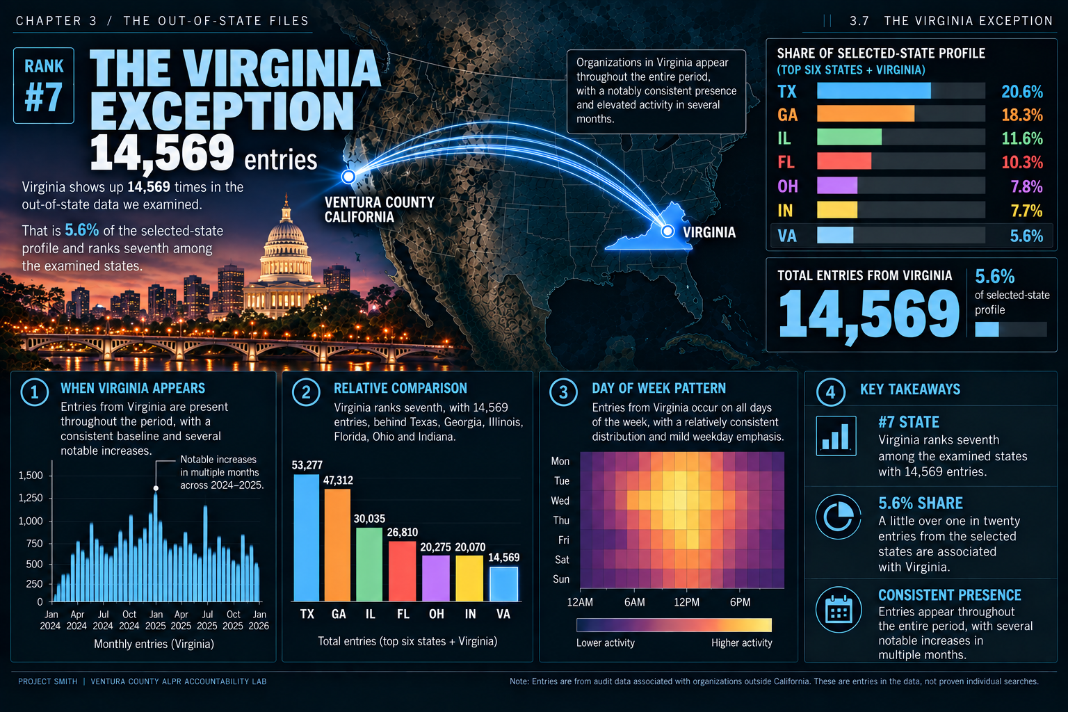
What this chart means—and how it was made
Shares use all 259,190 examined entries, even where the graphic says “top six.” Map arcs show state associations, not vehicle routes or search direction. The timing and duration plots have not been independently verified against the underlying audit files. This is Virginia’s entry-frequency view; Fairfax’s requested device-hours are explained below.
Source: State dashboard; audit-data methods and source limits are in Supporting Materials.
NOW LOOK AT REQUESTED SCOPE.
HOW MUCH CAMERA-TIME DID THE REQUESTS COVER?
WHAT IS A DEVICE-HOUR?
Think of it as how much camera-time a request covered. One camera or plate reader included for one hour is one device-hour. Multiply the number of devices by the hours in the requested window.
10 devices × 2 hours = 20 device-hours.
Device-hours measure the scope of requested camera-time—not an operator’s time running a search, footage watched, or footage received. They do not count unique cameras or people, or prove that a request returned a record.
ANALYSIS
Fairfax County Police Department
129.58 BILLION
requested device-hours · approximate delivered-row total
Sixth among individual non-California organizations by requested device-hours (delivered-row total).
“Delivered-row total” adds the device-hours across the audit rows delivered in the export—not footage delivered. The source also compares an exact-distinct total, which counts exact duplicate rows only once.
Check the source: the deeper device-hours analysis
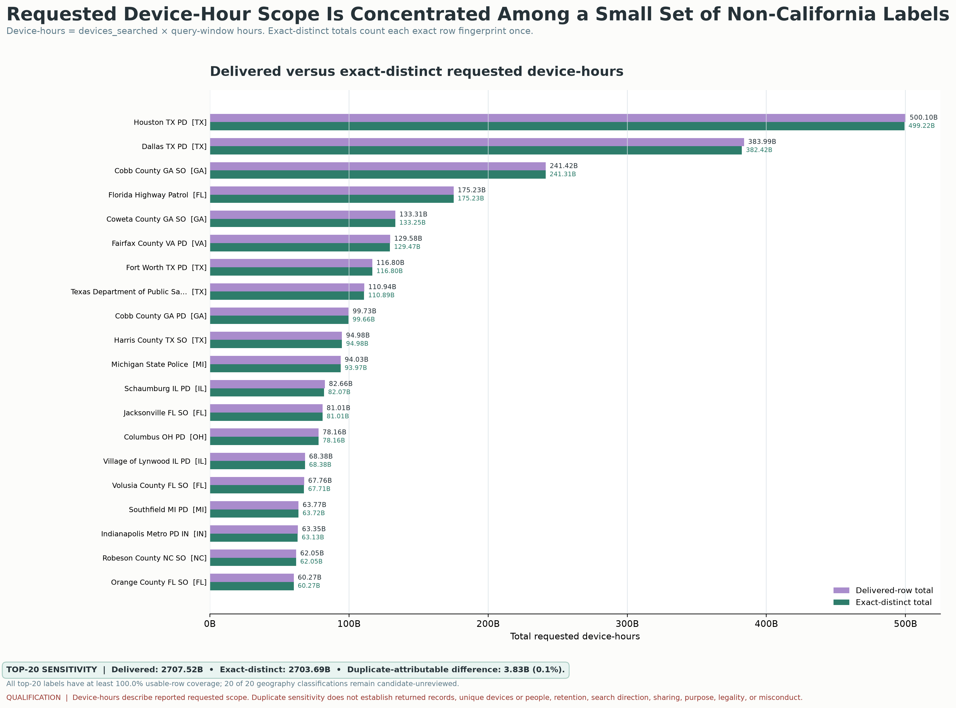
FEWER ENTRIES DOESN'T ALWAYS MEAN LESS REACH.
Virginia’s 14,569 entries are a statewide frequency count; Fairfax County’s device-hours are one organization’s requested camera-time. They are different measures at different levels. An organization can appear less often while requesting searches across more devices or longer time windows.
259,190 ENTRIES AREN'T THE ANSWER. THEY'RE THE REASON TO ASK.
- Why did names associated with distant states appear this often?
- Why were Texas and Georgia so large?
- Why did Illinois and Florida appear tens of thousands of times?
- Why were Ohio and Indiana nearly identical?
- Why does Fairfax County Police Department stand out in how much camera-time its searches asked to cover?
- WHAT CONNECTED THESE SYSTEMS?
- WHO COULD REACH WHAT?
- WHAT CHANGED?
- AND WHY THEN?
WHERE IS THE AUDIT?
UNRESOLVED
What did VCSO’s review find? What caused the issue? Which systems were affected, which relationships were involved, and what changed afterward? Where are the records showing the safeguards worked?
THIS WASN'T JUST A SPIKE. IT WAS A SUDDEN EXPANSION IN SCALE, GEOGRAPHY AND REACH.
The audit records show the footprint. VCSO later acknowledged a “data searching issue.”
Because the next question isn't whether anyone noticed.
THEY DID.
The states here are associated with the organization names in the audit files. Those files alone do not fully show who was searching whose data or what each search actually showed the user. How we matched names to states, and the limits of these files, are in Supporting Materials.
Supporting Materials
Want to check the work? Please do.
Check the work for yourself. The report, methods, legal sources, charts and details about the data are here when you want them.
Available materials vs. originals. Included here: charts, data files, the Civic Review Packet and collected legal sources prepared for this review. The packet explains specific findings page by page. The original Flock/Axon audit files, Camarillo presentation and records-request correspondence are not included.
The actual report
Praeva Analytics ALPR Audit Records Civic Review Packet · 33 pages · September 2026
Read the complete report alongside its charts. This packet contains the analysis prepared for the review, not the agency’s original audit files, response letters or presentation.
Read the report (PDF)Download the reportPage-specific report receipts
How we checked—and where to check for yourselfMethods, source receipts, legal cross-checks and records still needed.
- Sources found so far: official audit, assurances and original records still needed
- Report explanations and sources, page by page
- Outstanding source-retrieval request
- Official law and policy receipts
- Day-by-day data for the surge
- Monthly network data
- Index of the charts and data
Legal and policy source receipts
Source notes record verification against official California Legislative Information on October 4, 2026:
- Civil Code §1798.90.51 — operator policy must address collection, use, maintenance, sharing and dissemination; authorized roles and training; monitoring; sharing and transfer; custodian or owner; retention and destruction process.
- Civil Code §1798.90.52 — access record includes date/time, query elements, username/organization, and purpose; access limited to authorized purposes.
- Civil Code §1798.90.53 — end-user policy includes monitoring and a process for periodic system audits, plus sharing/transfer, custodian/owner, retention/destruction.
- Gov. Code §7922.525(b) — reasonably segregable portions available after exempt portions deleted.
- Gov. Code §7922.530 — identifiable nonexempt records promptly available; not a fixed final-production deadline.
- Gov. Code §7922.535 — 10-day determination/notice rule; written unusual-circumstances extension subject to statutory limits.
- Gov. Code §7922.540 — written partial/complete denial; names/titles of persons responsible; withholding must be justified.
- Gov. Code §7922.600 — duty to assist includes identifying responsive records, describing IT/physical location, and suggestions to overcome practical access barriers.
Project-produced-source cross-checks:
- VCSO Policy 429: department-approved training; five-year server retention with exceptions; regular audits; inter-agency agreement/access controls.
- Flock order form: `Retention Period: 365 Days`; extended retention up to one year.
A duty to maintain records or adopt a policy, a duty to disclose records under the California Public Records Act (CPRA), and evidence of actual compliance are three different questions.
Source routes checked
- Moorpark Public Meetings
- Moorpark City Council
- Moorpark Agenda Center
- Moorpark Oct. 7, 2026 City Council calendar
Original materials referenced by the investigation but not available here include the redacted Axon audit trail, records-request and deficiency correspondence, and Moorpark City Manager correspondence. Public receipts must protect requester-identifying information.
Original charts and a closer look at the evidenceOriginal report charts, comparison methods and the full-size image index.
The original report graphics are all here, with their labels, explanations, sources and full-size views. The image index below also includes the deeper analysis.
Out-of-state data: all state totals, methods and source limits
ANALYSISMatching organization names to likely states
Texas. Florida. Ohio. The interstate context matters.
The examined profile contains 53,277 Texas-associated entries, 26,810 Florida-associated entries, 20,275 Ohio-associated entries and 47,312 Georgia-associated entries. States are assigned from the organization names in the files. The separate organization profile adds frequency, persistence and requested-window context.
The daily evidence identifies an aggregate other-state surge. The state map compares audit-label populations by candidate-associated geography.
Verifying each state’s trend over time requires the underlying name-to-state classifications and dated entries, using the same periods and totals as the report.
State profile and broader map: source limits
The original map remains intact as an analytical receipt. The controlled supplemental profile includes 20,275 Ohio-associated audit observation rows.
Source status and remaining receipts. The totals are transcribed from the report, not independently recalculated from original exports.
All eleven state totals in the out-of-state data examined here
- Texas: 53,277 entries in the data
- Georgia: 47,312 entries in the data
- Illinois: 30,035 entries in the data
- Florida: 26,810 entries in the data
- Ohio: 20,275 entries in the data
- Indiana: 20,070 entries in the data
- Virginia: 14,569 entries in the data
- Michigan: 12,140 entries in the data
- North Carolina: 11,663 entries in the data
- Missouri: 11,642 entries in the data
- Tennessee: 11,397 entries in the data
Original state map · Organization profile · Original supplemental device-hours analysis (new tab) · Return to Chapter 03
Which states are associated with the organizations in the data?
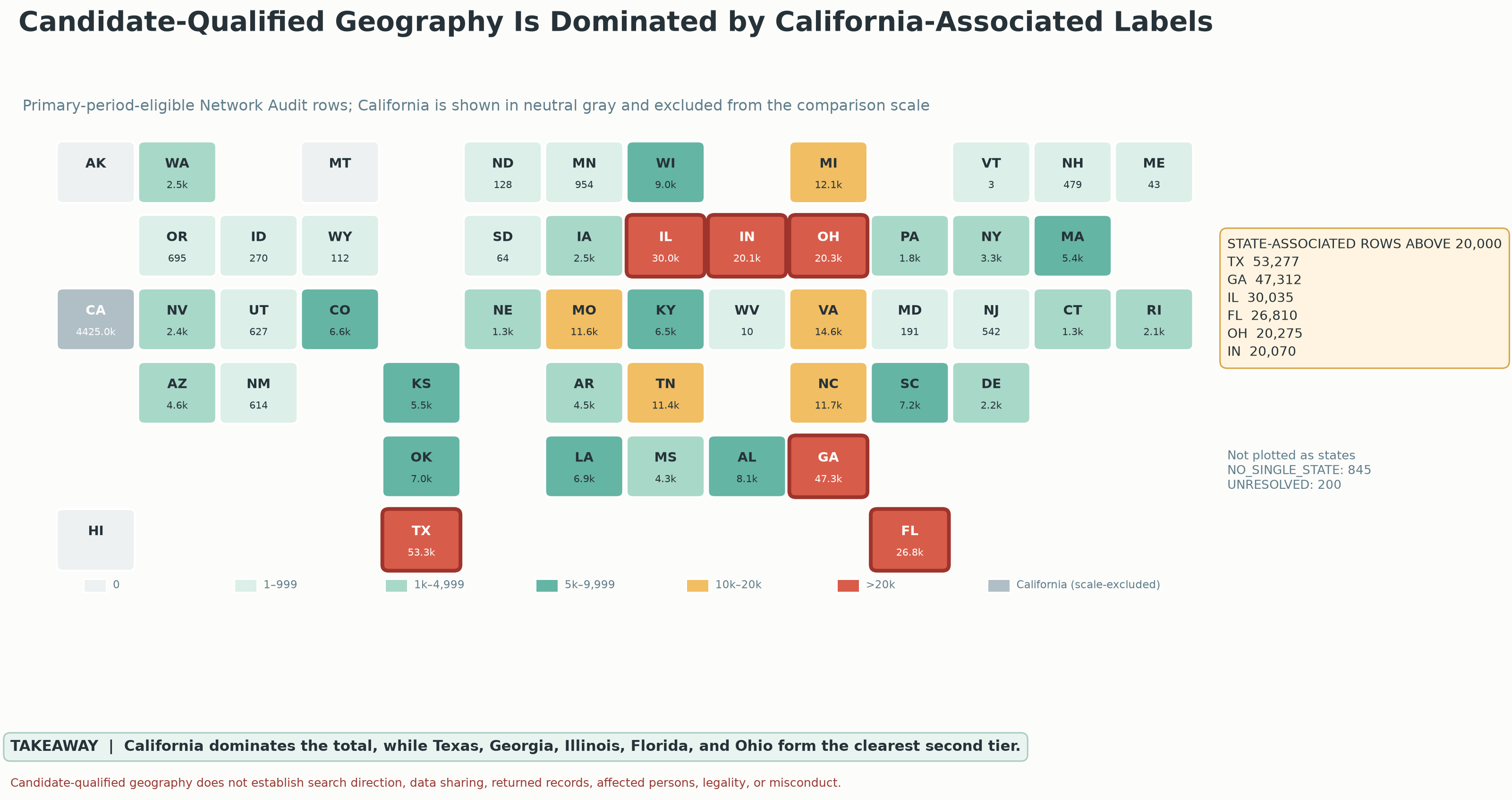
What this chart means—and how it was made
This original map classifies primary-period-eligible Network Audit rows by candidate-associated state. It compares populations rather than trends over time. The February–March surge appears separately in the daily-regime graphic. Unknown or multi-state labels remain separate.
Source: Praeva Analytics candidate-state map; totals are transcribed from the analytical report, not independently recalculated. Original name-to-state classifications and dated state-level tables are not available here.
How often did these names appear, for how long, and how far back did searches look?
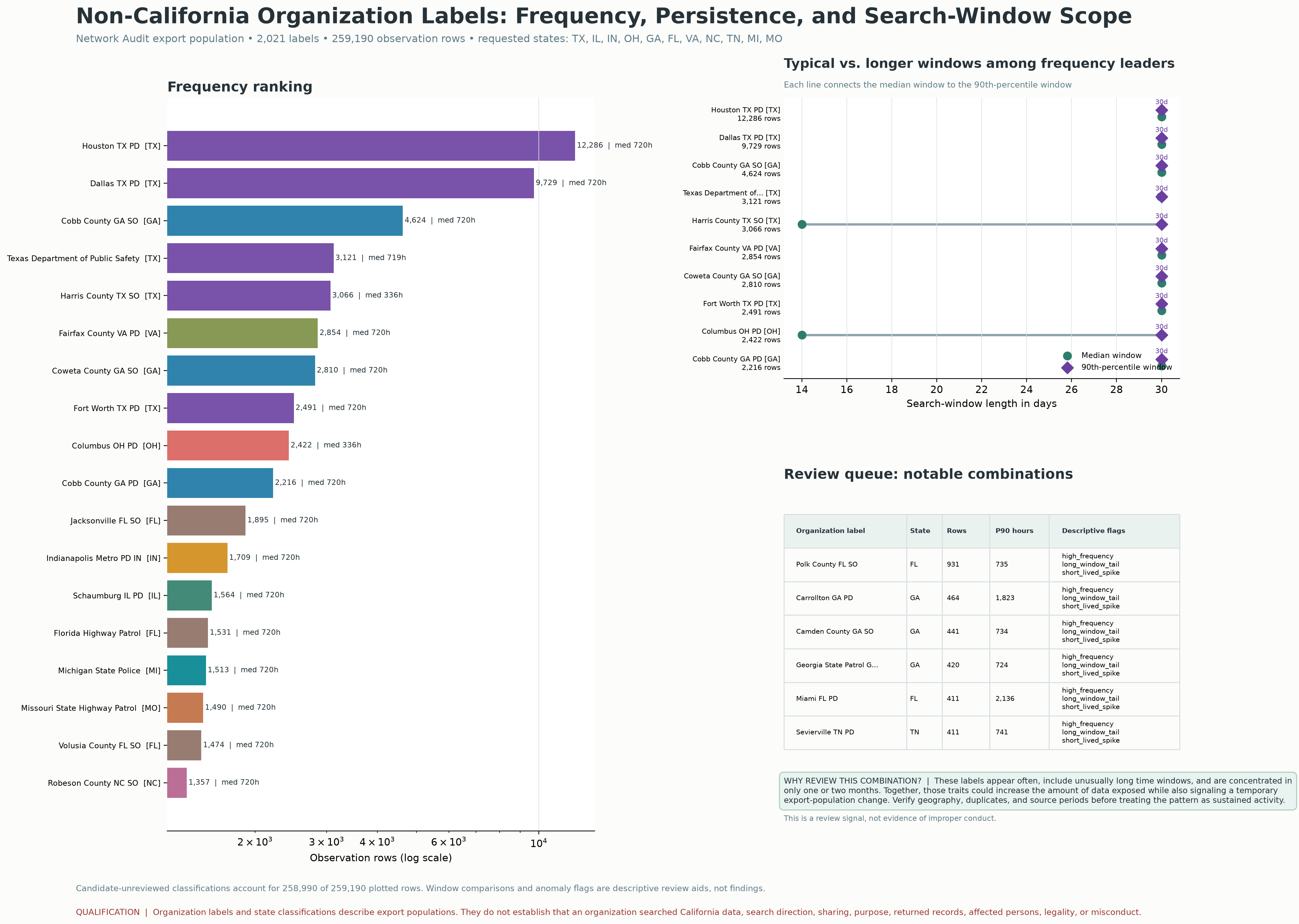
What this chart means—and how it was made
The graphic compares export rows, observed persistence and requested time windows for a selected non-California label population. The controlled supplemental profile includes 20,275 Ohio-associated audit observation rows. Review flags identify labels for further examination.
Source: Praeva Analytics organization profile; Civic Review Packet pp. 6–7 explains the screening approach. Underlying classification and query-level tables are not available here.
NCRIC connects a region—not just one local agency.
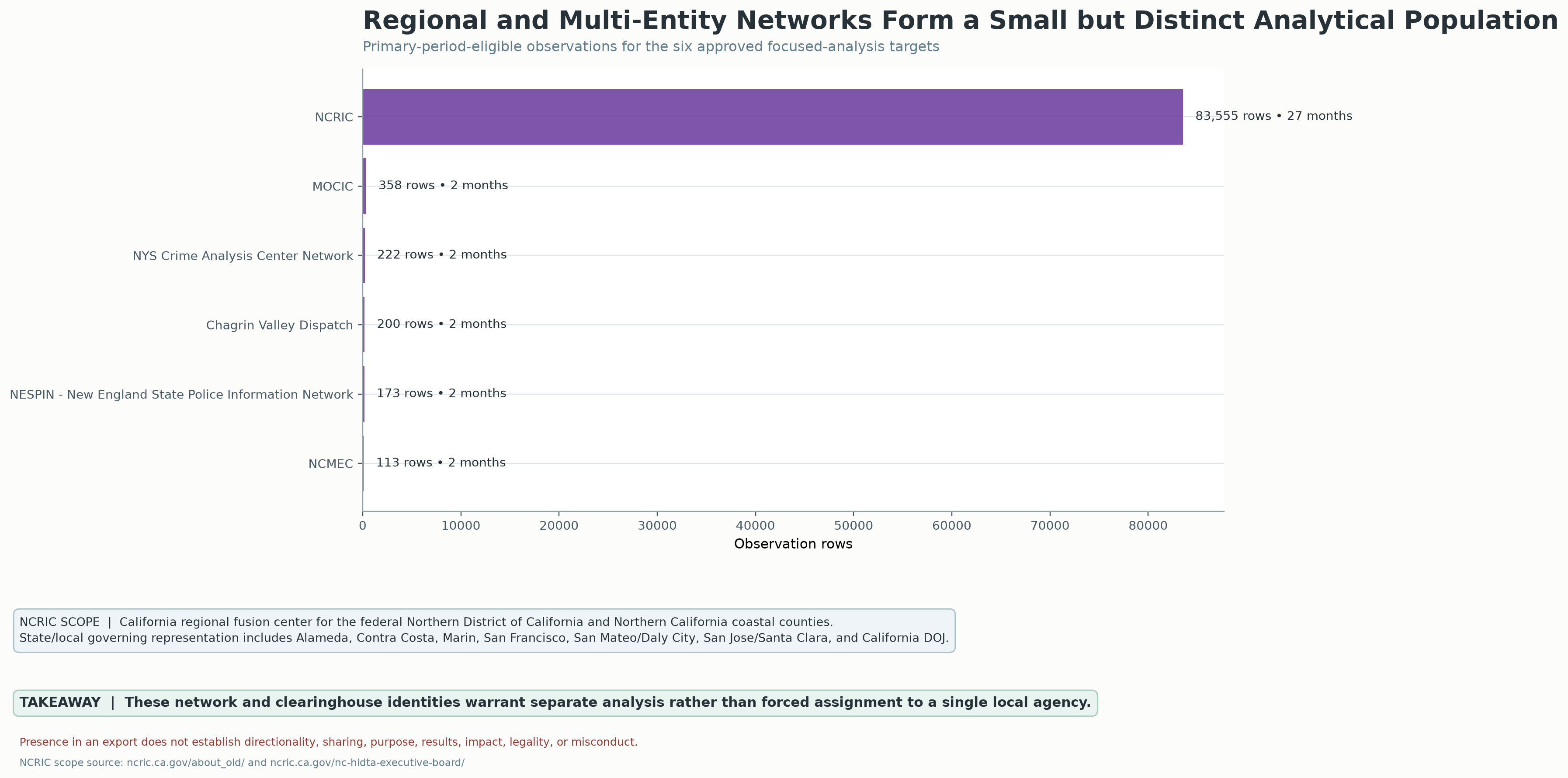
What this chart means—and how it was made
The graphic describes NCRIC as a California regional fusion center serving the federal Northern District and Northern California coastal counties. It cites NCRIC scope and governance pages. The comparison uses entries in the report’s eligible period for six selected networks.
Source: Praeva Analytics regional-network graphic; scope references: ncric.ca.gov/about_old/ and ncric.ca.gov/ncric-hidta-executive-board/. Underlying network export is not available here.
NCRIC appears less often—but its searches could reach more networks.
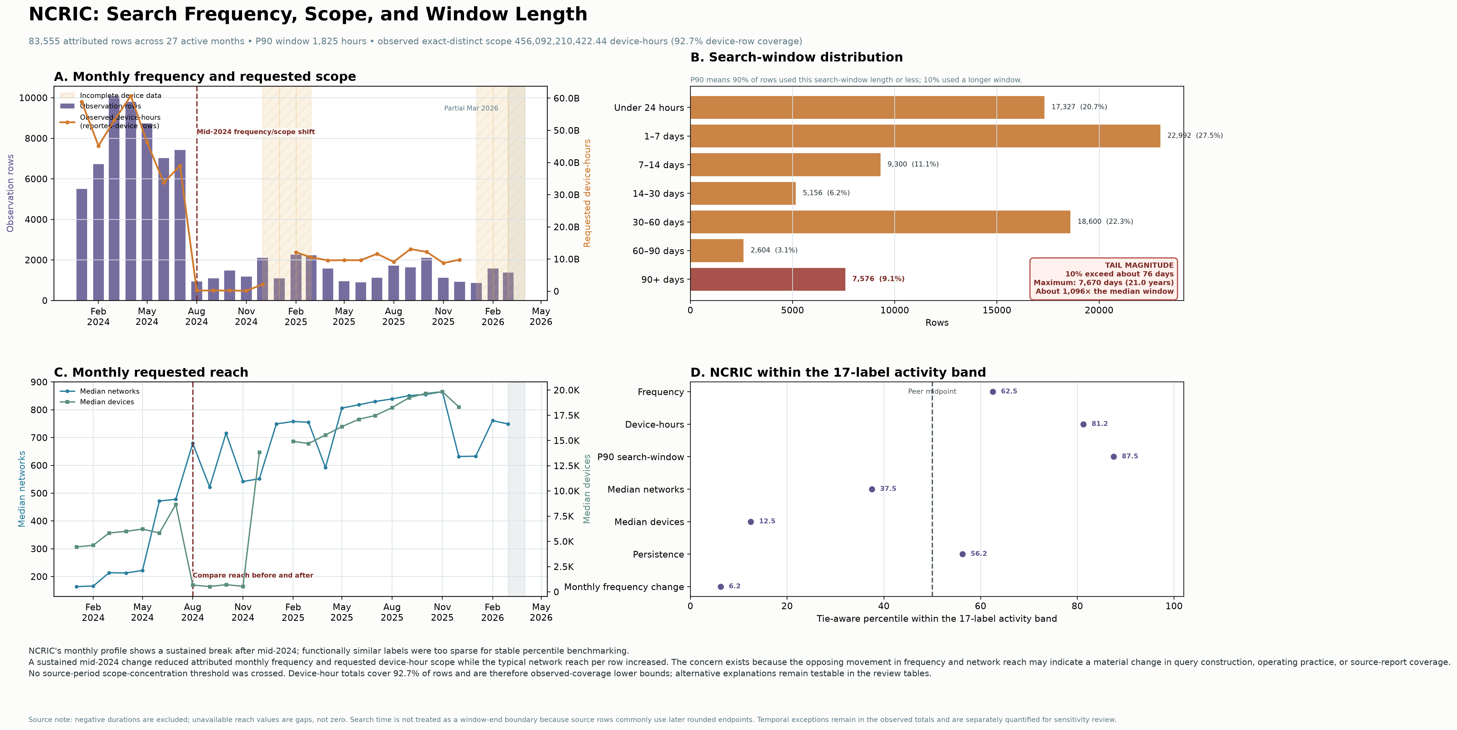
What this chart means—and how it was made
Monthly attributed rows, requested scope, requested windows and activity-band comparisons describe different dimensions. The graphic warns against treating the source-period scope concentration threshold as constant. Device-hour coverage is incomplete; time ranges represent requested windows. The profile identifies review questions about query construction, practice and export coverage.
Source: Praeva Analytics NCRIC profile; Civic Review Packet pp. 24–25 explains the mid-2024 change and possible source/reporting explanations. Query-level data and original export are not available here.
More than cameras: the system that has to be accounted for
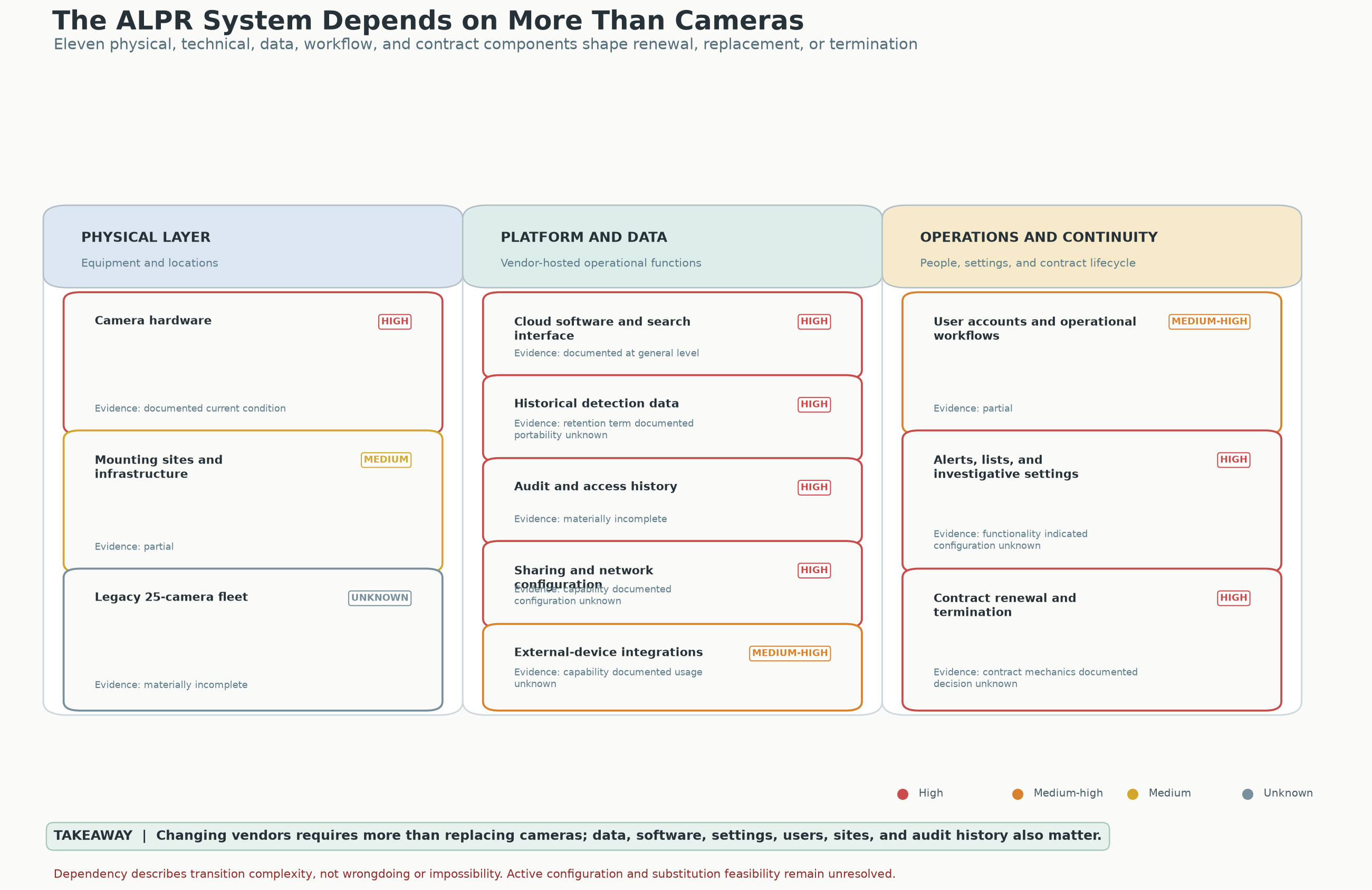
What this chart means—and how it was made
The original graphic maps dependencies across the physical layer, platform/data, and operations. Its ratings describe transition complexity. Active configuration and substitution feasibility require further records.
Source: Praeva Analytics capability-dependency graphic accompanying the analytical report.
A 29-day change, with a visible ending
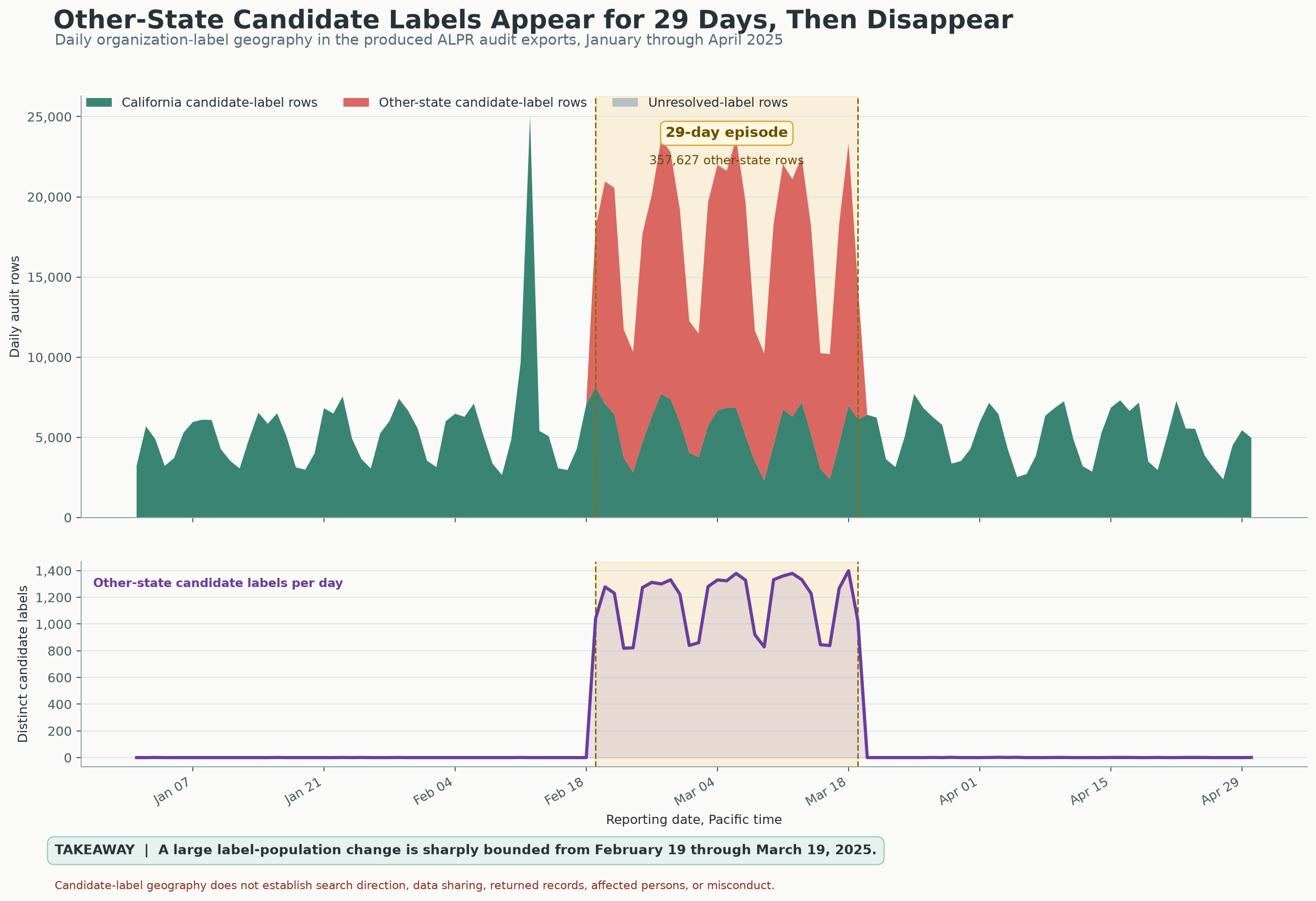
What this chart means—and how it was made
The upper panel shows daily audit rows; the lower panel shows distinct other-state candidate labels. Both identify the same bounded interval.
Source: Praeva Analytics daily graphic; Flock exports analyzed in daily_regime.json.
The monthly view shows the change in scale—and the return
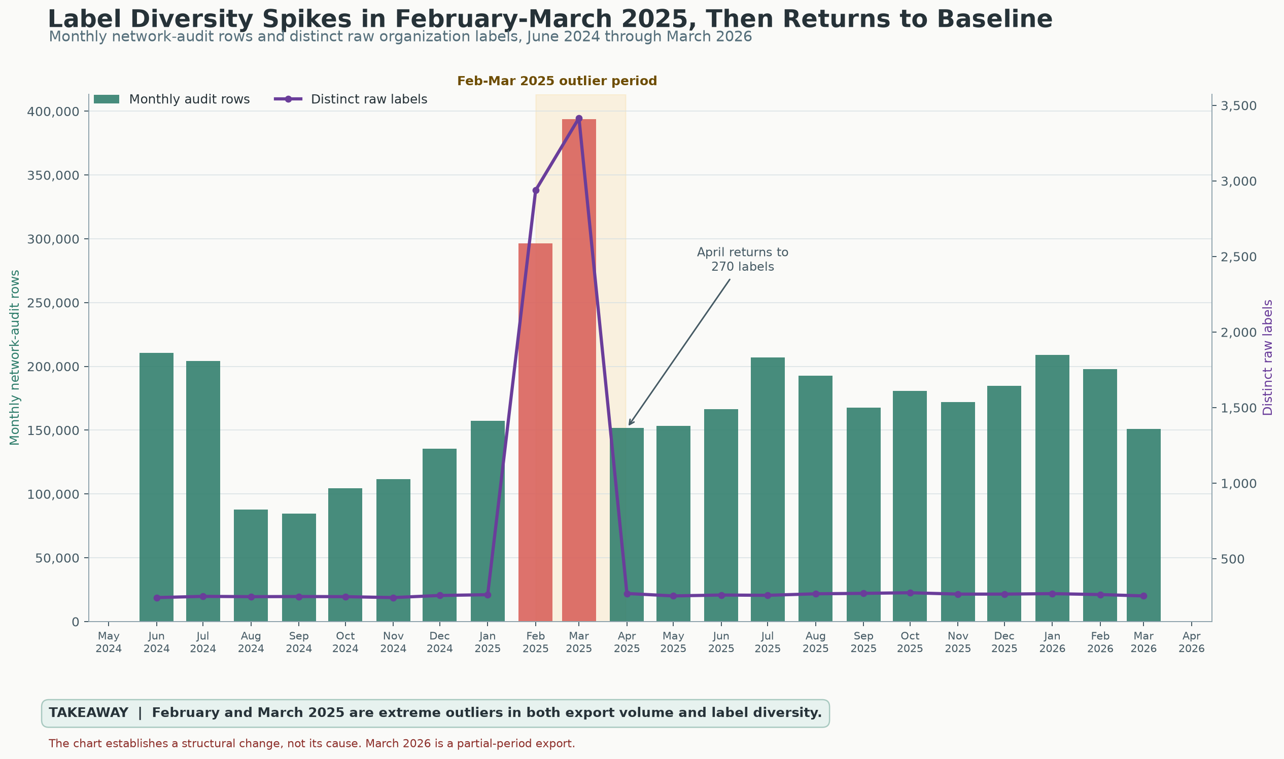
What this chart means—and how it was made
Bars count monthly network-audit rows; the line counts distinct raw organization labels. These are exported populations, not verified people, searches, recipients or search direction. The chart establishes structural change, not cause. March 2026 is a partial-period export.
Source: Praeva Analytics monthly graphic and monthly_network.json.
An activity file is not a complete account of who did what.
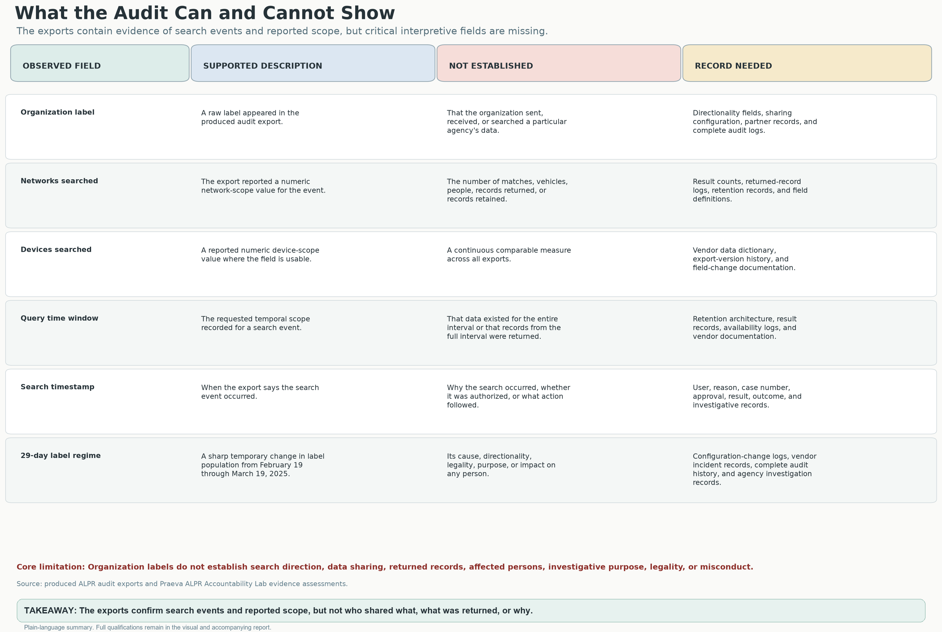
What this chart means—and how it was made
The original matrix organizes documented observations, interpretations and the records needed to answer questions about access, sharing, purpose and results.
Source: Praeva Analytics evidence-boundary matrix accompanying the report; original exports are not available here.
Promises need records the public can test
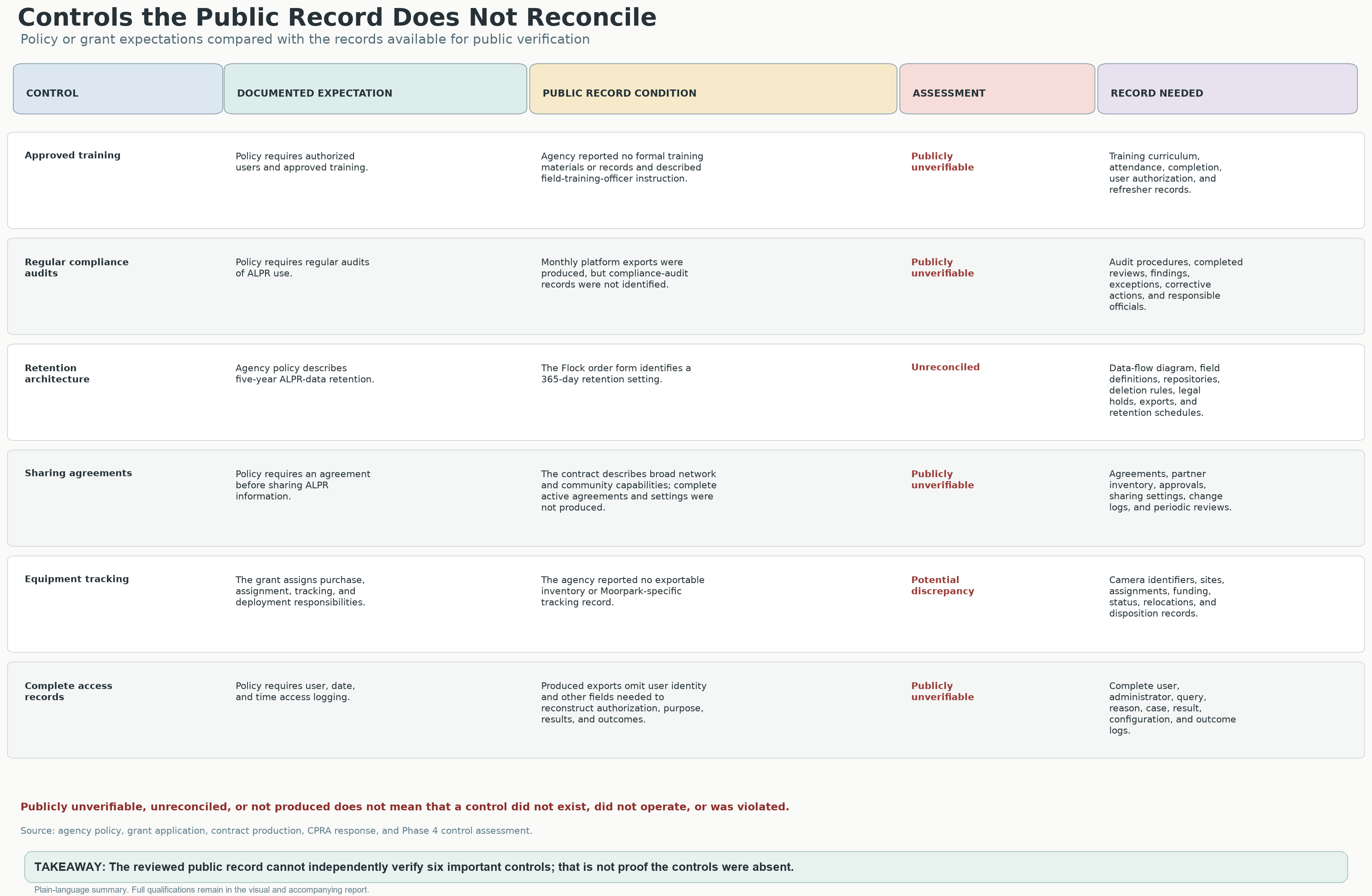
What this chart means—and how it was made
The original comparison covers training, compliance audits, retention, sharing agreements, equipment tracking and complete access records. The accompanying policy and contract references require repository-specific reconciliation.
Source: Original Praeva Analytics public-control reconciliation graphic; project analysis of policy, grant, contract and public-records materials.
How VCSO compares with other agencies
ANALYSISExplained in the report; original agency-by-agency data not included
The comparison group changes the answer
In several groups, VCSO ranks high for how often it appears and how far back its searches looked. The comparison is more mixed for how many networks and cameras its searches typically could reach.
| Comparison group | Number of agencies | Why compare them? |
|---|---|---|
| California sheriffs | n = 40 | Agencies with a similar role |
| Activity band (0.5×–2× VCSO) | n = 4 | Similar activity totals, not necessarily similar duties |
| Population band (±25%) | n = 4 | Agencies serving similarly sized populations |
| Nationwide sheriffs | n = 848 | A broader comparison |
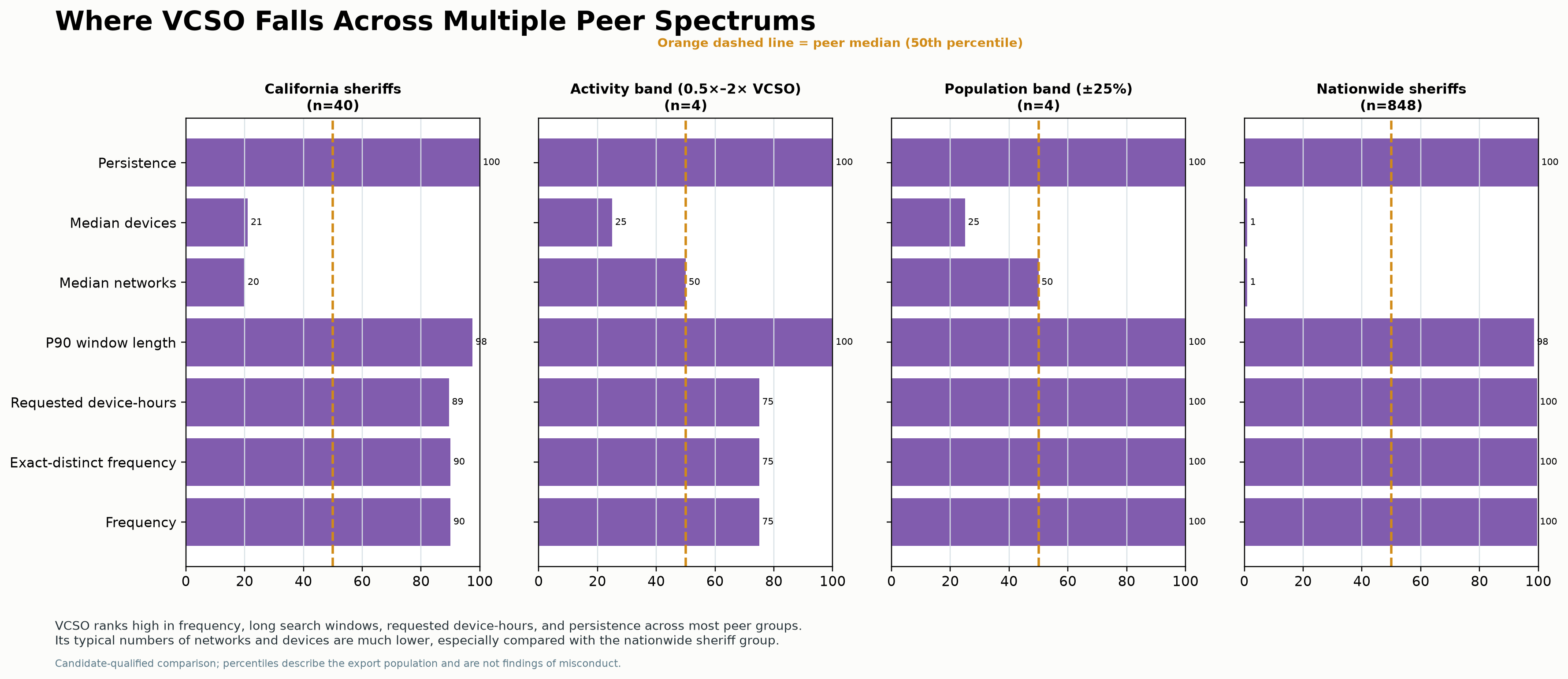
What this chart means—and how it was made
The four panels compare California sheriffs, an activity band, a population band and nationwide sheriffs. Cohorts vary greatly in size, so percentile rankings are not interchangeable. These candidate-qualified comparisons describe the export population.
Source: Praeva Analytics peer-percentile graphic; Civic Review Packet pp. 10–11 and methods p. 31. Comparison-group definitions and sizes appear in the image; raw membership and metric tables are not available here.
These rankings describe the comparison, account for ties and are not grades. Small groups can change greatly when different agencies are included. The full agency lists and how they were grouped still need to be checked.
Source: Civic Review Packet, pp. 10–11 and methods p. 31. Report explanation, not raw comparison-group data.
Funding over time
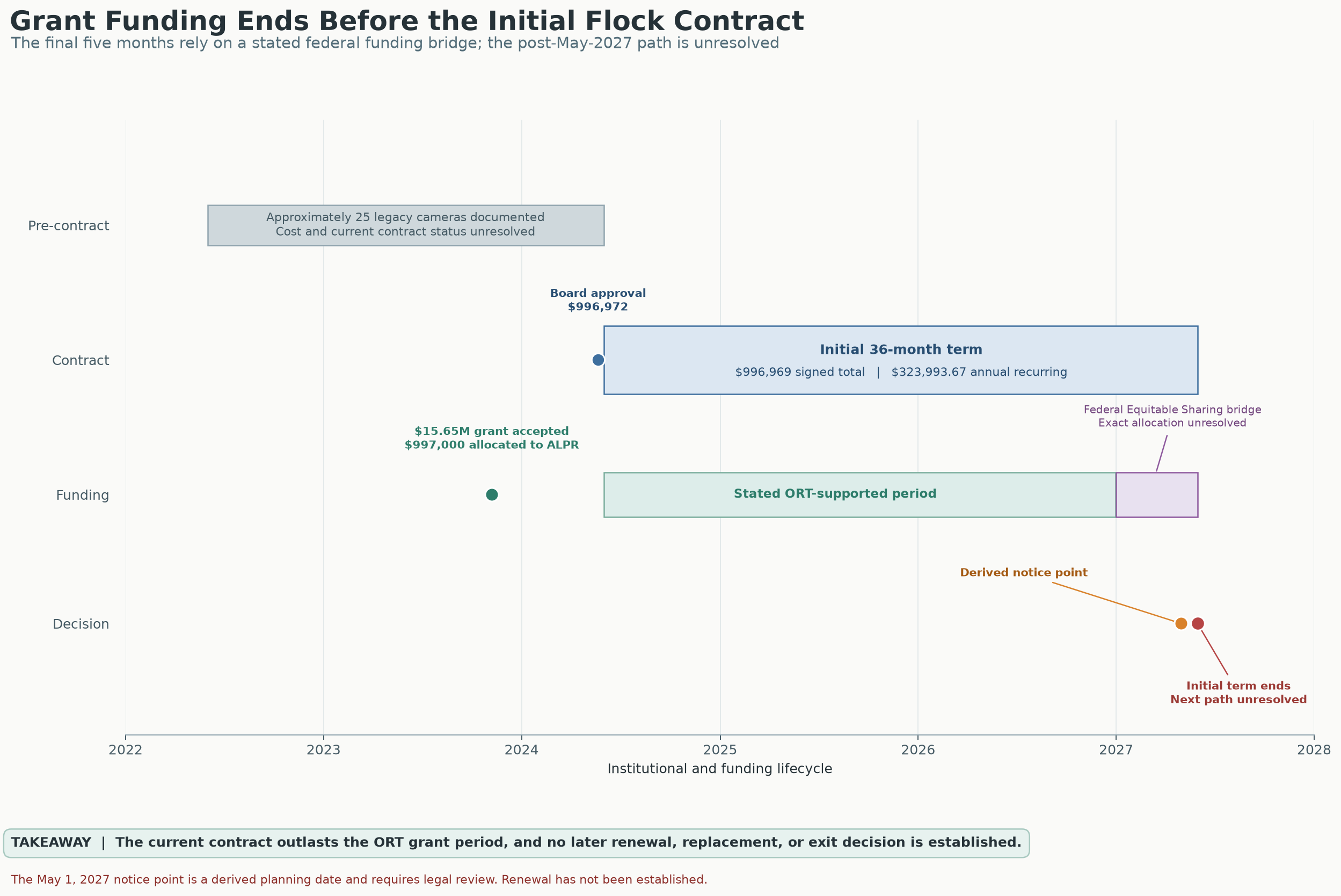
What this chart means—and how it was made
Read this project-provided timeline alongside the report and legal receipts; it is not a substitute for the original procurement, grant or contract records.
Source: Praeva Analytics funding timeline accompanying the analytical report.
All original charts · 28 PNG images
Each link opens its original image, without cropping or recompression.
Original report charts
- The 29-day surge
- Monthly expansion
- What the files can—and cannot—tell us
- Funding over time
- How the systems connect
- Promised safeguards vs. the records provided
Charts from the deeper analysis
- Expanded monthly trends
- Map of likely states associated with organization names
- A closer look at regional networks
- Organizations associated with states outside California
- Camera-time requested: total device-hours
- How VCSO ranks against other agencies
- How VCSO’s ranking changes by month
- VCSO before, during and after the surge
- How different assumptions affect the combined VCSO comparison
- Organizations with Ventura in their names
- How broadly VCDA searches could reach
- How broadly VCSO searches could reach
- How broadly NCRIC searches could reach
- VCSO entries and how much unusual activity stands out
- VCSO camera locations: DeFlock context
- All graphics together for visual review
- The 29-day surge · supplemental package copy
- Monthly expansion · supplemental package copy
- What the files can—and cannot—tell us · supplemental package copy
- Funding over time · supplemental package copy
- How the systems connect · supplemental package copy
- Promised safeguards vs. the records provided · supplemental package copy
Story infographic originals and evidence notesFull-resolution editorial artwork, Chapter 8 receipts and evidence limits.
These seven editorial graphics accompany the investigation. The notes distinguish measured findings from illustrated claims that remain unverified.
Chapter 8: graphics and source receipts
Official VCSO 2025 Military Equipment Annual Report — April 22, 2026
DOCUMENTED Official Ventura County Sheriff’s Office report, dated April 22, 2026, covering January 1–December 31, 2025. Its reported inventories and usage are agency-reported figures, not independent operational verification.
- Open preserved official report (PDF; new tab)
- Original report on VCSO’s official website (new tab)
- Page-specific receipts and claim boundaries
Research leads—not findings of misconduct
UNRESOLVED 70 “Homeless related operations”: What did those drone operations involve? Who approved them? How long was data kept, and which systems could receive it? These events cover the overall program, not Wingtra alone.
UNRESOLVED 81 Organized Retail Theft operations. What UAV workflows and safeguards were used? The report does not document any relationship between these UAV events and Flock or Axon.
UNRESOLVED Approximately $15,229 for “network video upgrades, enhanced recorders and associated equipment.” This appears under ROOK/tracked-armored-vehicle equipment costs, from the existing FY 25/26 budget (printed page 5; PDF page 6). Ask what equipment and governing rules it covered. The report does not establish a relationship to ALPR, Axon or Fusus. It is a follow-up lead only.
The Chapter 8 comparison is a governance recommendation, not a claim that ALPR is covered by AB 481 or that a statutory reporting violation occurred.
Axon switcheroo: sources, original graphics, and evidence limits
The graphics illustrate possible connections, not a verified local system map. Vendor capability is not confirmed VCSO deployment. The cell-site-simulator purchase and integration remain unverified.
1 · How ALPR Data Moves
This is a conceptual illustration, not a verified feature inventory for a particular ALPR device or a map of VCSO’s deployed system. People or objects visible in an image are not necessarily identified, indexed or separately searchable. VCSO-specific records are needed to establish video capture, enabled tools and actual search results.
Source: editorial infographic. Compare with the analytical report, report receipts and source status; the artwork is not an agency record or a new calculation.
2 · A Wide Network of Access
The lines show possible ways to get access, not completed searches, returned information or verified local connections between vendor platforms. Dated agreements and settings records are needed to check federal, out-of-state and international access. The California-agency label represents an attributed assurance, not a verified inventory of all current or historical sharing.
Source: editorial infographic. Compare with the analytical report, report receipts and source status; the artwork is not an agency record or a new calculation.
3 · Audit Assurances vs. Records Received
Flock Organization and Network Audit Logs and an Axon audit trail were received. “Not provided” means missing accountability detail, not no activity files or proof that a record does not exist. Original presentation and response records are needed to verify the quoted wording and categories.
Source: editorial infographic. Compare with the analytical report, report receipts and source status; the artwork is not an agency record or a new calculation.
4 · Who Can Access the Data?
These are possible users and connections, not a checked list of who has access now. The 58-agency statement is what VCSO said at a particular time, not the full history of settings or use.
Source: editorial infographic. Compare with the analytical report, report receipts and source status; the artwork is not an agency record or a new calculation.
5 · February–March 2025 Anomaly
The measured series counts entries and organization names. The artwork’s reach and network lines are illustrative, not calculations from the daily/monthly datasets. March 2026 is partial.
Source: editorial infographic. Compare with the analytical report, report receipts and source status; the artwork is not an agency record or a new calculation.
5.2 · Frequency and Requested Scope Are Different Questions
The report compares NCRIC across January–July 2024 and August 2024–February 2026. The artwork uses October 2024–March 2026; its ratios (~70% fewer searches, ~3× scope, ~4× networks), camera counts and international access remain unverified. What a search asked to cover is different from what it actually showed.
Source: editorial infographic. Compare with the analytical report, report receipts and source status; the artwork is not an agency record or a new calculation.
6 · Six Key Takeaways on Surveillance Oversight
This image brings the argument together. The findings remain tied to the records and measurements explained above; the illustrations of access and growth are not additional findings.
Source: editorial infographic. Compare with the analytical report, report receipts and source status; the artwork is not an agency record or a new calculation.
The labels tell you what supports each statement: DOCUMENTED = backed by a record provided or an official source, with the source limits stated; VCSO SAYS = the agency’s account; PLATFORM CAPABILITY = a vendor-described function, not confirmed VCSO deployment; ANALYSIS = a conclusion drawn from the available evidence; UNRESOLVED = the available records leave the question unanswered.